

There’s something undeniably calming about the colour blue. It’s the hue of open skies and endless oceans—a colour that speaks of serenity, depth, and vastness. From the soft pastel of a morning sky to the rich midnight shade that blankets the night, blue has a way of grounding us while stirring the imagination. The beauty of the colour blue is timeless.
Historically, blue has carried deep symbolic meaning. It’s long been associated with trust, loyalty, and wisdom. Artists have turned to blue to evoke emotion, from Picasso’s melancholic Blue Period to the iconic vibrancy of Yves Klein’s International Klein Blue.
Beyond symbolism, blue is simply beautiful. It cools and soothes, balances and inspires. Whether it’s the faded blue of your favourite jeans or the bold splash of cobalt in a painting, blue never overwhelms—it invites you in, quietly and confidently.
THE DESIGN IN BEAUTIFUL BLUES
In a world full of noise and colour, blue is the breath between moments. Calm. Constant. Infinite.
It anchors us—a quiet presence in the chaos. From the pale hush of morning skies to the deep, endless pull of the ocean, blue evokes serenity and space. It’s the colour of trust, of clarity, of thought. Designers turn to blue not just for its aesthetic versatility, but for its emotional depth. It cools heated palettes, opens up confined spaces, and speaks in a language both universal and intimate. Whether used boldly or in subtle undertones, blue brings balance. It reminds us to pause, to breathe, to feel.
THE SOFTER BLUES STORY
“Soft blues are like a whispered lullaby for the home—they gently quiet the mind and soften the edges of a space without ever overpowering it.”
— Clara Moreau, Interior Designer
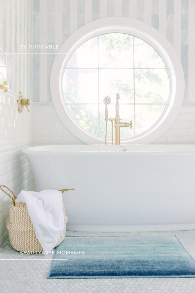
Whispering Elegance In Every Detail
A palette that captures the gentlest moments of the day—morning mist, soft petals, and skies kissed by first light. These hues speak in hushed tones, offering a sense of quiet luxury and graceful simplicity. Ideal for spaces and designs that seek to soothe, soften, and invite serenity—Spa-like interiors, baby nurseries and dressing rooms.
Blue doesn’t always have to speak loudly. Sometimes, its power lies in a gentle whisper—in soft pastels, pale sky tones, and delicate patterns that evoke a sense of serenity. With softer blues you can explore a subtler side of the spectrum, using blue to create a space that feels light, calming, luxurious, and effortlessly elegant.
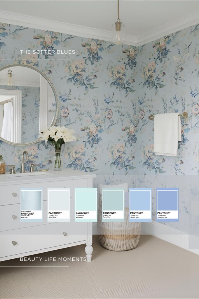
A Breath of Fresh, Floral Air
This refined powder room or dressing space is a romantic ode to soft living. A floral wallpaper washes the room in layered tones of sky, seafoam, and whispery blue, offering a timeless yet fresh aesthetic. It’s a gentle escape from the day-to-day, a place where blue becomes a breath of fresh air.
Palette Notes:
Blue Claire • Bit of Blue • Mint Julip • Pastel Blue • Whispy Blue • Baby Blue Jay
An ode to softness—where every shade feels like a sigh of relief.
Despite its delicate nature, this palette has depth. The layering of florals, pale blues, and crisp white detailing results in a design that is both airy and intricate. The elegant brushed chrome hardware and the soft curvature of the mirror add polish and sophistication to a space that could otherwise feel overly traditional.
This is softness redefined—not plain or forgettable, but poised and intentional.
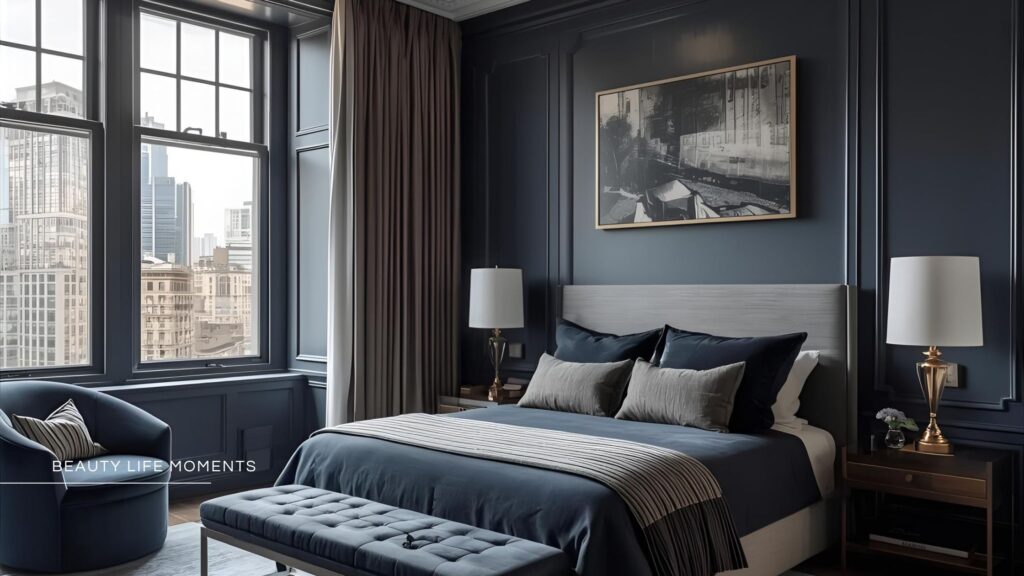
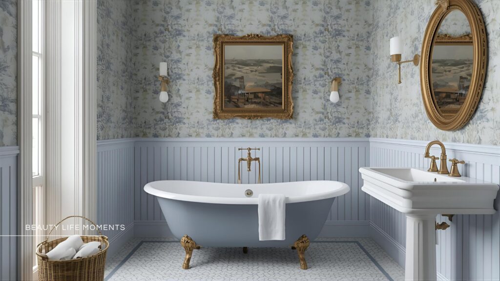
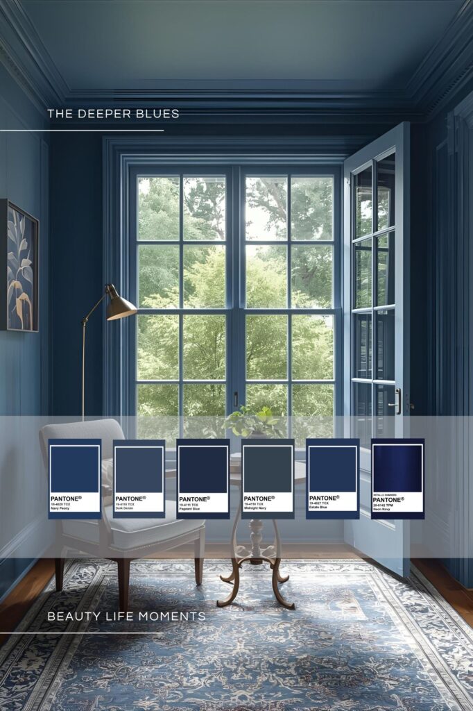
THE DEEPER BLUES
“Deep blues are architectural in spirit. They bring gravitas to a room—anchoring it with elegance, depth, and an effortless sense of sophistication.”
— Elliot Grant, Interior Architect
The deepest blues have a depth that holds an elegance and a quiet power. Rooted in richness, this palette draws from stormy seas, twilight shadows, and the timelessness of classic denim. These saturated tones exude confidence and sophistication—perfect for designs that demand presence without noise. Think: moody libraries, navy accent walls, velvet upholstery, and classic masculine refinement.
A Room with Depth and Story
Blue has a remarkable ability to adapt—sometimes fresh and airy, other times soft and nostalgic. But in its deepest tones, blue becomes powerful. Deeper blues allow you to explore the confident, dramatic side of blue: where heritage meets modern luxury, and depth becomes the design.
Palette Notes:
Navy Peony • Dark Denim • Pagent Blue • Midnight Navy • Estate Blue • Neon Navy
A study in strength and sophistication—the blues that linger long after the sun has set.
While many fears dark colours will make a space feel smaller, this room proves the opposite. The deep blues blur architectural lines, making the space feel expansive and cohesive. Light from the large windows bounces off velvet textures and glossed trim, preventing the room from feeling heavy or oppressive. Adding a piece of artwork that reflects the palette anchors the room.
Accents like the antique-style area rug, brass lamp, and tailored upholstery elevate the drama while maintaining balance.
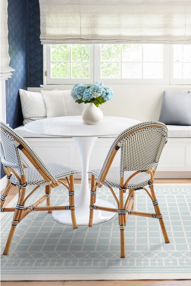
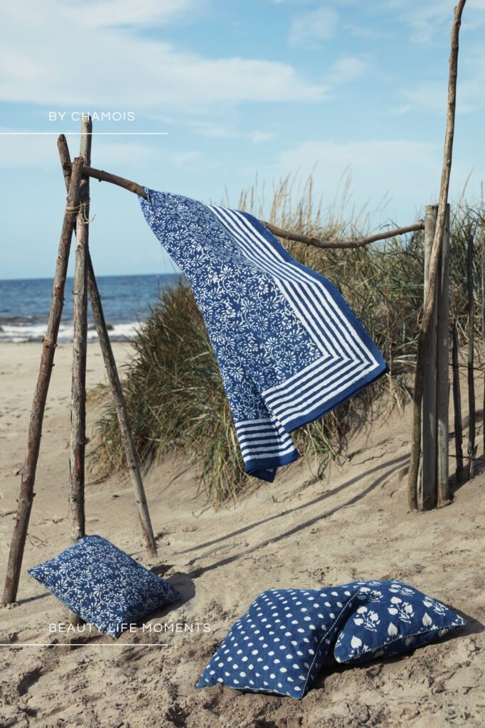
THE COASTAL BLUES
“Coastal blues are timeless because they breathe. They bring the outside in—light, air, and a sense of freedom that never feels forced.”
— Sienna Blake, Coastal Interior Stylist
Inspired by salt-kissed air and the rhythm of the tide, this coastal palette is breezy, refined, and timeless—never cliché. Soft yet structured, it evokes nostalgia and fresh beginnings, capturing midnight skies, stormy seas, and quiet mornings by the shore.
The coast’s natural beauty—rolling waves, misty light, and deep ocean blues—translates effortlessly into interior spaces. True coastal design avoids obvious nautical themes, instead embracing nature’s palette: stormy blues, soft greys, sandy whites, and sky-washed tones.
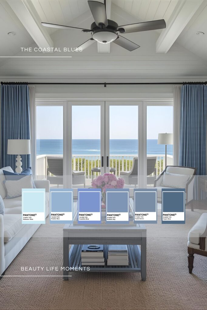
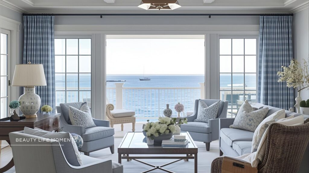
Where Hamptons Elegance Meets Seaside Charm
In a room grounded by beautiful coastal blues take your cues from the Hamptons, where coastal elegance is a lifestyle. Known for its breezy sophistication and relaxed refinement, the Hamptons aesthetic is both timeless and effortlessly chic. It’s about clean lines, quality materials, and a palette that feels as fresh as the ocean breeze.
Palette Notes:
Saltwater Slide • Powder Blue • Coastline Blue • Endless Sky • Faded Denim • Copen Blue
Where sea meets sky and simplicity becomes sublime.
Beautiful accent tones within the blue spectrum add subtle depth and sophistication. Salty and powder blues softens a palette, evoking clear skies and morning light, while ocean slate and muted navies introduce cooler, grounding elements reminiscent of stormy seas. Dusky indigos or ink blues can add a touch of drama, particularly in textiles or statement pieces, without overpowering the space. Even whispers of teal or sea glass blue—used sparingly—can lift the mood, suggesting water in motion or sunlight dancing on waves. These layered blues work together to create a space that feels cohesive, calming, and timeless—always anchored in the ever-changing beauty of the coast.
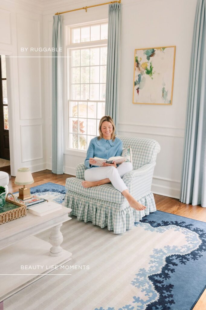
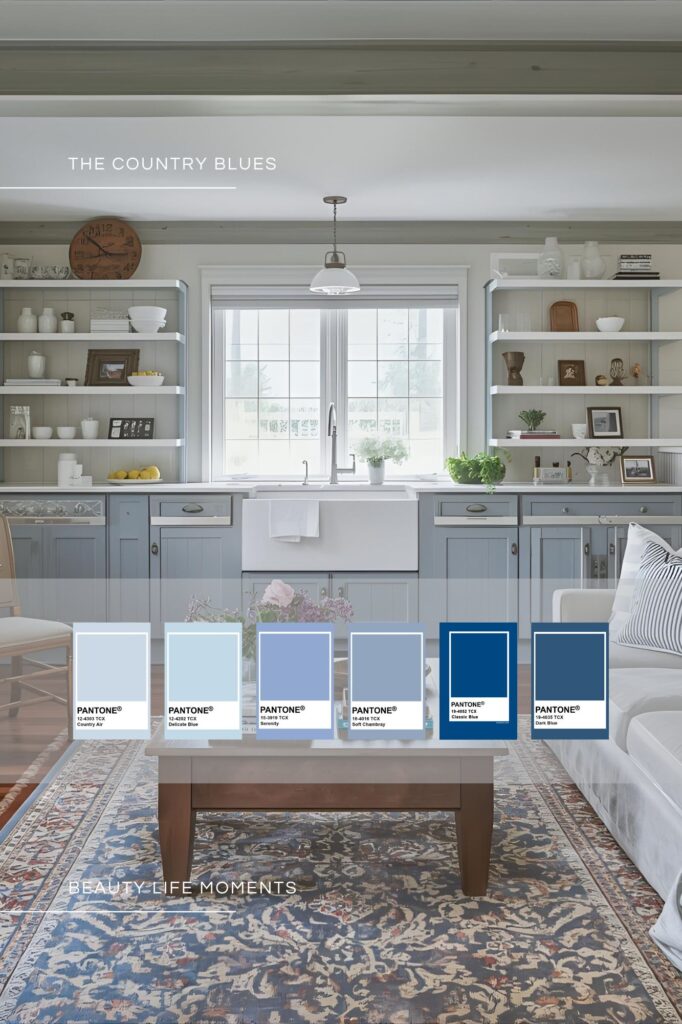
THE COUNTRY BLUES
“I want to get up in the morning and let the dogs out, hear the birds, have my coffee, and have a sense of peace.”
— Bunny Williams, Interior Designer
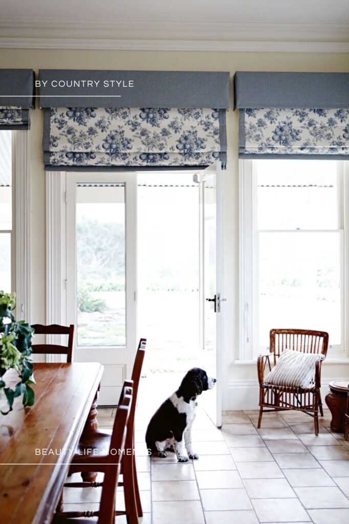
There’s a quiet strength in blue—its ability to calm, comfort, and inspire makes it an enduring choice in interior design. The country blues are about embracing a palette of blues that balance classic charm with modern serenity. From airy pastels to grounded navy hues, this curated selection can set a tone for a living space that is both timeless and tranquil—no matter its purpose.
A Feeling of Serenity and Country Charm
The country blues can create a space where country farmhouse sensibilities meet coastal calm. In a kitchen the inclusion of shaker-style cabinetry, ceramic accents, and open shelving bring a down-to-earth warmth, while the clean whites and airy layout keep things modern. By layering blues across cabinetry, textiles, and decorative details, the room invites relaxation without sacrificing style.
Palette Notes:
Country Air • Delicate Blue • Serenity • Soft Chambray • Classic Blue • Dark Blue
A palette of calm inspires by the heart of country charm
In this palette a harmonious blend of blues creates a space that feels both inviting and refined. The lightest hues—Serenity, Soft Chambray, Country Air, and Delicate Blue—cast a gentle, airy glow, reminiscent of morning light filtering through farmhouse windows and soft linens drying in the breeze. These soothing tones bring an effortless calm, setting the stage for moments of quiet reflection. Anchoring the palette, Classic Blue offers a touch of timeless tradition, evoking the enduring spirit of rural heritage, while Dark Blue adds depth and strength, grounding the room with a sense of stability and warmth. Together, these shades paint a picture of country living—where comfort meets elegance, and every corner feels like home.
To Shop The Moments: Discover Chamois for exclusive textiles for unique homes, elegant patterns—all printed by hand. And for beautiful rugs, runners, doormats, and bath mats look no further then Ruggable —for washable rugs to add style and charm to your home.
More To Covet
Dreaming of Denmark — A Culinary Journey: As you journey through Denmark’s culinary landscape, you will discover that every bite tells a story of a place and of a unique Scandinavian philosophy. Dreaming of Denmark is a beautiful Nordic culinary journey. Read The Story: Or, discover more about how Elegant gifts celebrate their unique spirit with thoughtfulness and care in The Art Of — Beautiful Elegant Gifting. It’s not about extravagance, but the intention and personal touch. Read The Story:


